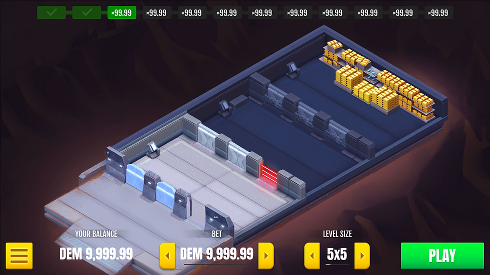
The first desktop UI version of bet and level size selection before start playing

The first desktop UI version during gameplay, after choosing level size and bet amount

Finalized by the rest of the design team, less color clues, more personality.
The first desktop UI version of bet and level size selection before start playing
Cash & Dash
Cash & Dash was a fast-paced heist-themed casino game developed for the Rivalry platform. Players had to infiltrate a high-security bank, navigating traps and obstacles to steal the treasure and escape while increasing their multiplier rewards.
I created the game’s in-game animations using Spine, including character animation, environmental interactions, UI feedback, and gameplay events. I also designed the initial UI/UX for browser and mobile, contributed to new gameplay features such as the fast autoplay drone mode, and optimized animations for real-time performance.
Unfortunately, the game is no longer available, since the company operations have now ceased, but you can still watch a few gameplay online.
Animation
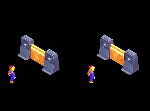
I was responsible for animating most of the game, including characters, doors, UI elements, modals, and visual effects.
For the main character, I reused and adapted a pre-existing 3D walk cycle to save production time. All other animations were created in Spine 2D, balancing smoothness with performance.
Due to the game’s small resolution, readability was a key concern. I used strong key poses and slightly exaggerated, direct motion to ensure clarity across desktop and mobile.
As an online game, performance was critical. I optimized atlas sizes through reduced exports and compression techniques, and structured assets in modular pieces to allow reuse through recoloring, flipping, and recombination.
For the choice reveal, I focused on timing to build tension. Both outcomes share the same animation until the last moment, slowing down before resolving abruptly to enhance anticipation and impact.
UI/UX
I designed the first iteration of the game’s UI, inspired by simple, clean, and flat casino interfaces, while introducing subtle color cues to guide the player’s attention without competing with the core gameplay.
The initial approach focused on a non-diegetic interface, prioritizing clarity and usability. As the project evolved, the art direction shifted toward a more diegetic style, and the UI was adjusted accordingly.
The process started with a desktop-first approach and later expanded to mobile. As priorities shifted toward a mobile-first direction, the interface was further refined, requiring adjustments to the desktop version to maintain consistency across platforms.
The final UI was later developed by the team, building on the initial direction with a more integrated visual style and stronger personality, aligning more closely with the company’s broader visual language.
The broader use of orange helped unify the interface, though it slightly reduces clarity compared to common color conventions.
Overall, it’s a solid evolution that builds on the initial foundation while pushing the visual identity further.
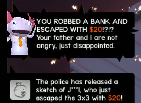
For modals, I aligned the design with Rivalry’s tone and humor while keeping communication clear and direct, with strong contrast and readability.
Animations were designed to be fast and interruptible to maintain flow and avoid frustrating the player. Key moments, such as the win and chicken-out states, emphasize the value gained, reinforcing the reward. In contrast, the game over modal shifts focus toward character and animation, making the outcome feel less punitive and more engaging.
After the game’s release, we introduced an additional feature: Auto-Turbo mode. The goal was to automate gameplay and deliver faster outcomes, designed for different play styles while increasing session pace.
This required creating the fastest possible animations while keeping them readable and meaningful. To support this both visually and contextually, we introduced drones as a diegetic alternative to the main character.
I modeled the drone in Blender, maintaining the game’s low poly visual style to ensure readability on small screens. I then rendered the assets and created the modals and in-game animations using Spine 2D.

We also planned to add an animated version of one of Rivalry's character into the social feed menu.
The idea was to emphatize some achievements of other online players in a comic way, like if the character was a journalist anchor givind the news and even freaking out sometimes.